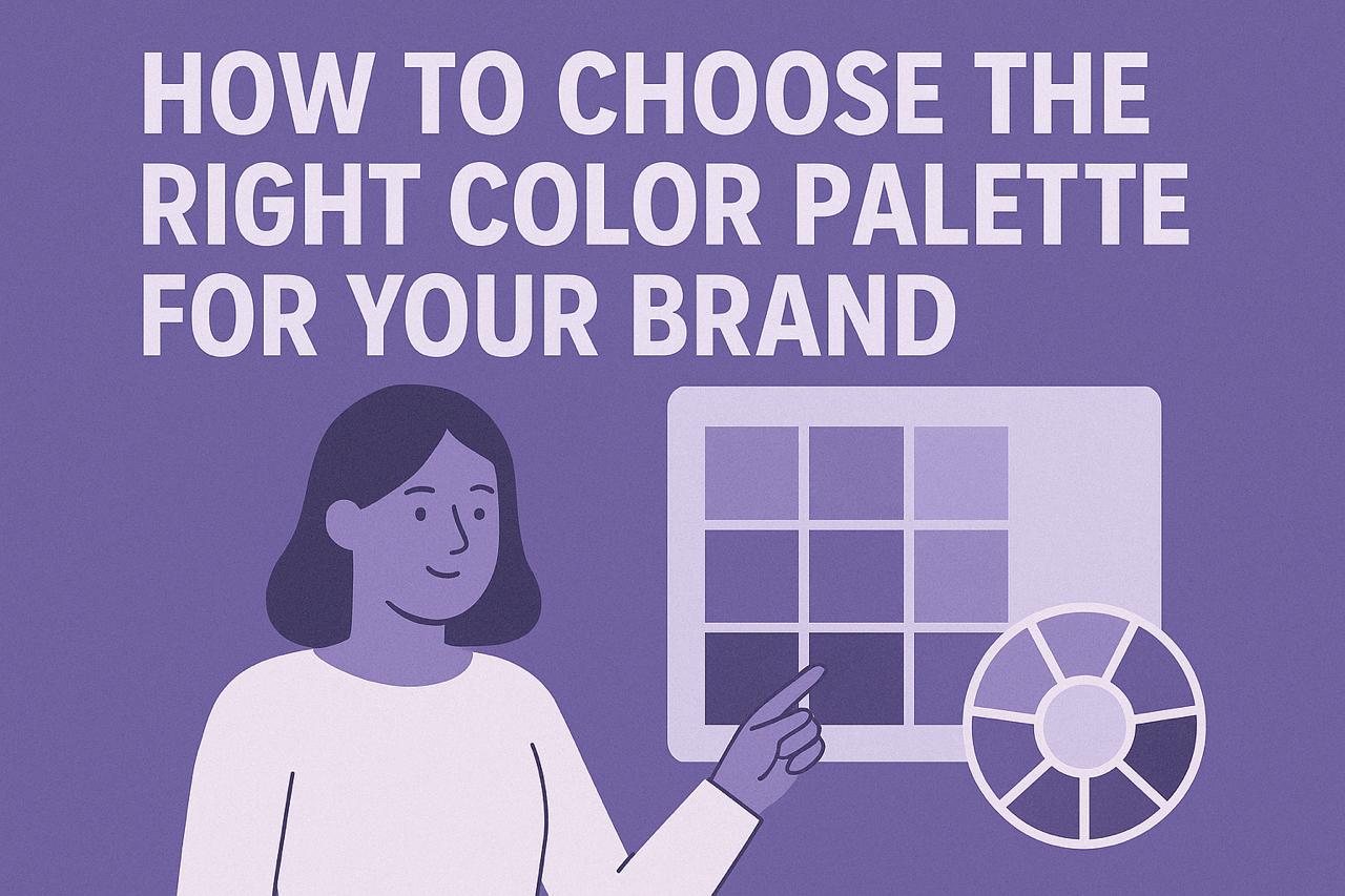
Creating the Perfect Color Palette for Your Brand
Creating the Perfect Color Palette for Your Brand
Learn how to develop a strategic color palette that communicates your brand's personality and creates recognition across all touchpoints.

The Strategic Role of Color in Branding
Color is one of the most powerful tools in a designer's arsenal. It can evoke emotions, communicate values, and create instant recognition. For brands, a well-crafted color palette is more than just an aesthetic choice—it's a strategic business decision.
At Geique Tech, we approach color selection as a critical component of brand strategy. This article explores our methodology for creating effective color palettes that align with brand objectives and resonate with target audiences.
The Psychology of Color in Branding
Colors carry psychological associations that can significantly impact how a brand is perceived:
- Blue often conveys trust, reliability, and professionalism—making it a popular choice for financial institutions and technology companies
- Red can evoke excitement, passion, and urgency—effective for brands wanting to stimulate action
- Green typically suggests growth, health, and sustainability—ideal for environmental or wellness brands
- Purple is associated with creativity, luxury, and wisdom—often used by premium or innovative brands
- Yellow communicates optimism, clarity, and warmth—good for brands wanting to appear accessible and friendly
However, these associations aren't universal. Cultural context, industry norms, and specific shade choices all influence how colors are perceived.
"The right color palette doesn't just look good—it communicates your brand's personality and values without saying a word."
Our Color Palette Development Process
1. Brand Strategy Alignment
Before selecting colors, we thoroughly analyze the brand's:
- Core values and personality traits
- Target audience preferences and expectations
- Competitive landscape (to either align with industry norms or deliberately stand apart)
- Long-term business objectives
This strategic foundation ensures color choices support broader brand goals rather than simply following design trends.
2. Primary Color Selection
The primary brand color is the most recognizable element of your visual identity. When selecting this color, we consider:
- The emotional response it evokes
- Its distinctiveness within your competitive landscape
- Its versatility across applications
- Its ability to remain effective over time
3. Building a Comprehensive Palette
A complete brand color palette typically includes:
- Primary color: The signature color most associated with your brand
- Secondary colors: Complementary colors that provide flexibility and contrast
- Accent colors: Used sparingly for emphasis or calls to action
- Neutral colors: For text, backgrounds, and supporting elements
We develop these color relationships using established color theory principles while ensuring the palette works harmoniously as a system.
4. Accessibility and Functionality Testing
Effective color palettes must be functional as well as beautiful. We test potential palettes for:
- Accessibility: Ensuring sufficient contrast for readability and WCAG compliance
- Versatility: Confirming colors work across digital and print applications
- Scalability: Testing how colors perform at different sizes and in different contexts
- Reproducibility: Verifying colors can be accurately reproduced across mediums
Technical Considerations for Color Palettes
Color Modes and Specifications
For comprehensive brand guidelines, we provide color specifications in multiple formats:
- RGB and HEX values for digital applications
- CMYK values for print materials
- Pantone (PMS) colors for specialized printing and color matching
- HSL/HSB values for design software and certain digital applications
Color Hierarchy and Usage Rules
Clear guidelines for color application ensure consistency across brand touchpoints:
- Specific color combinations for different applications
- Proportion guidelines (e.g., 60/30/10 rule for primary/secondary/accent colors)
- Background/foreground relationships
- Contextual usage rules (e.g., which colors to use for different message types)
Case Study: Color Palette Development
For a recent wellness technology client, we developed a color palette that balanced seemingly contradictory brand attributes:
- They needed to convey both technological innovation and natural wellness
- Their audience valued both scientific credibility and holistic approaches
- They wanted to appear premium without being inaccessible
Our solution was a palette centered around a teal primary color (balancing blue's trustworthiness with green's natural associations), complemented by warm accent colors and clean neutrals. This palette successfully communicated their unique positioning at the intersection of technology and wellness.
Evolving Your Color Palette
While consistency is crucial for brand recognition, color palettes sometimes need to evolve:
- During major brand repositioning
- When expanding to new markets with different cultural associations
- To address functional issues discovered in implementation
- To refresh a dated visual identity while maintaining recognition
Successful color evolution maintains core brand recognition while allowing for necessary adaptation.
Conclusion: Color as Strategic Asset
A thoughtfully developed color palette is more than a design element—it's a strategic business asset that builds recognition, communicates values, and creates emotional connections with your audience.
At Geique Tech, we help brands develop color systems that not only look beautiful but also work strategically to support business objectives across all touchpoints.
Related Articles


Enjoyed this article?
Subscribe to our newsletter for more insights on design and technology.